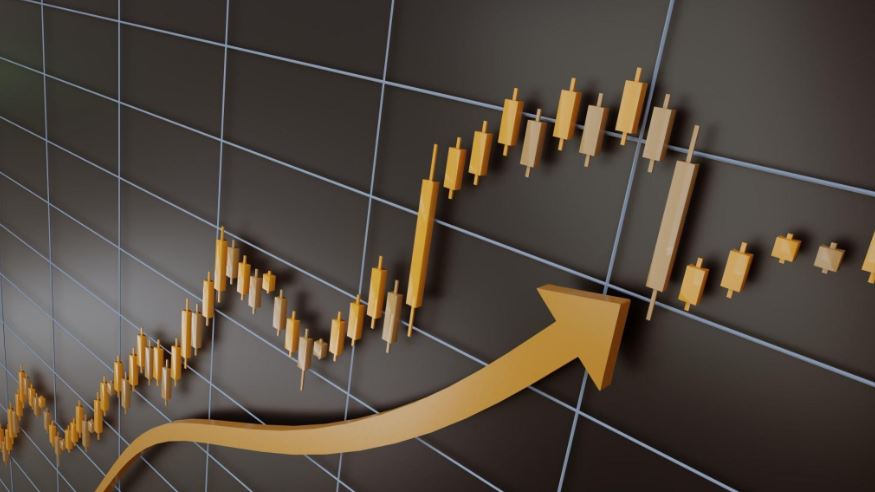
Gold rate in Pakistan charts are an essential resource for any investor or trader looking to get up-to-date information on gold prices. They can provide insight into trends and patterns that could indicate whether or not it is a wise time to buy or sell. But how can one learn how to read and understand these charts?
First, it’s important to understand the different components of a gold rate chart. Charts can be divided into two main parts: the horizontal axis (time range) and the vertical axis (price movement). The x-axis is usually used to denote time frames ranging from years down to minutes, while the y-axis typically shows variations in price movements over this same period of time. Anything that happens within this time frame can be easily identified by examining the chart; for example, big jumps in price may signify market activity or news events that have caused the rise/fall in values.
In addition to helping traders find trends and make predictions, gold rate charts can also be useful in helping investors determine when might be a good time to buy/sell their positions depending on what they see happening in the markets. For instance, if there is a noticeable dip followed by a steady incline then this could be a sign that now may be an opportune moment for buying before prices start climbing again.
It’s also important to note that these charts can vary greatly depending on which source you use; for instance online sites like Kitco provide up-to-the minute data whereas other sources like Bloomberg offer more detailed longterm analysis covering multiple days/months etc.. As such, it’s worth researching which charting options best fit your trading needs before making decisions based off of any given chart.

